Architechpro logo design process
As probably any company, at some moment of time we have realized that as amount of projects and products we work on increases, we started to have a need in a bigger amount of high-quality media assets related to our company branding. Thus, team took the decision to redesign our company logo. The goal was to update it, make it look modern and more recognizable for our clients and meet the current logo trends.
Our old logo quickly designed by us as we started to work on our first products
During the development of a new logo we were guided by the following principles
- Simplicity: clean and not complicated look of the logo
- Memorability: logo should be flexible and easily recognizable
- Appropriateness: logo needs to resonate with the desired audience
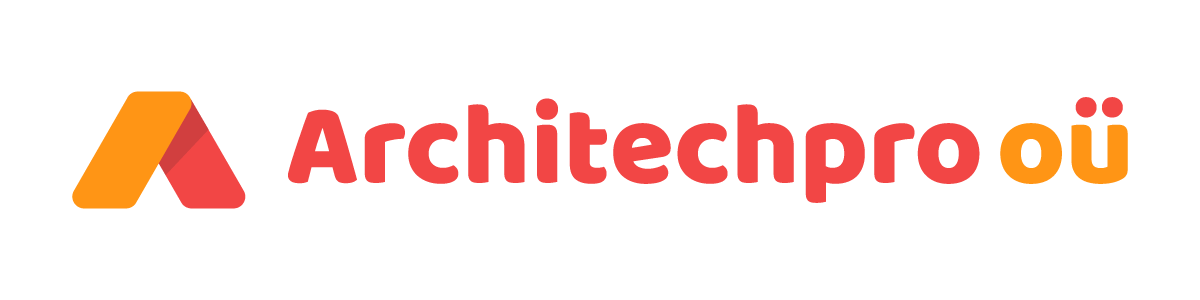
In past we used the text-only logo, so the font was the main element of it. You will probably agree – it looked cumbersome and not individual. We decided to add some kind of symbol that would represent our company and associate with it. For this purpose we’ve chosen letter “A”. This is the first letter of the company name, and also it symbolizes something new, a new start. As well as our company is always ready to start new projects, we are open to opportunities.
Here are some sketches of this idea
Color
We picked shades of orange to demonstrate energy and motivation. But at the same time, orange color symbolizes reliability and safety, which are the key ideas of our company.
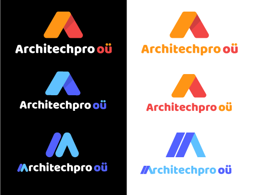
We’ve created several logo options for use in various areas:
Horizontal
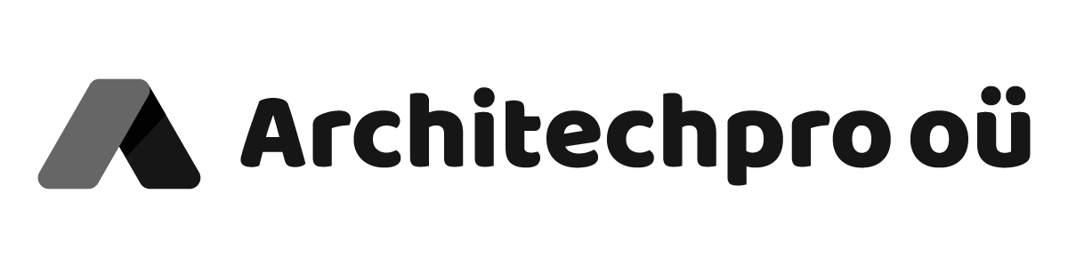
Black and white – for print purposes
And the icon for mobile applications, favicon, profile pictures, social media, etc:
 Feel free to let us know what do you think about before and after logo options in comments below. Any suggestions are always appreciated 🙂
In case if you are interested in logo creation / help in branding, analytics, UI / UX, send us the project request and we’ll get back to you within 24 hours.